Hoban Cards Bookmarks
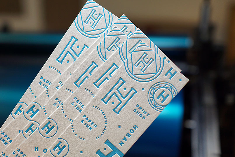
Every so often we get time for some fun internal projects. We recently completed these Hoban bookmarks, which will be included in all new Hoban Cards orders - while supplies last. These 5" x 1.5" bookmarks are printed on Colorplan's 130# Natural White stock, which provides durability and rigidity for the task at hand. As much as we love 100% cotton paper, Colorplan is a great alternative for cards that require more heavy-duty use cases. The lovely Pantone 306 provides a great contrast to the warm off white paper color. ∞
• • •

Gabriel Michael Photography
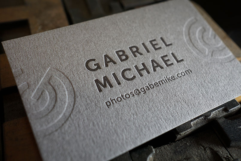
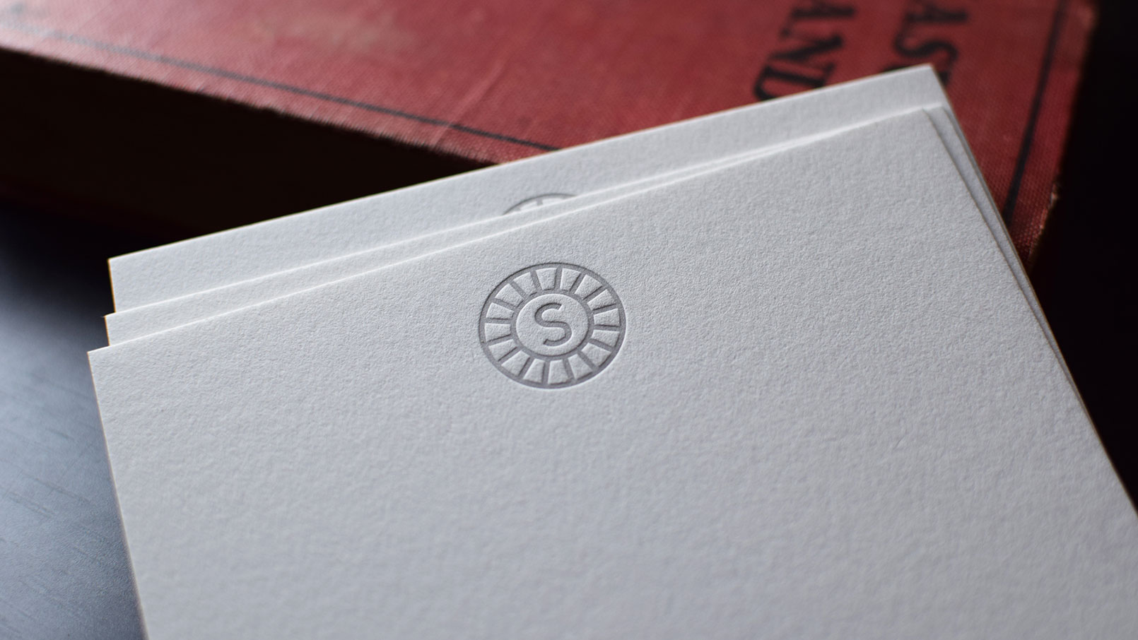
It was a joy to design these simple, but striking business cards for talented photographer and friend, Gabriel Michael. Many of our jobs are printed on white or light 100% cotton papers, but we chose to explore the option of producing these on Colorplan's 200# Smoke Grey. With the blind impressions of Gabriel's logomark bleeding off on both sides, the layout created a very simple, albeit unique, spin on a conventional letterpress printed business card. ∞
• • •

Lisa Cron | Design
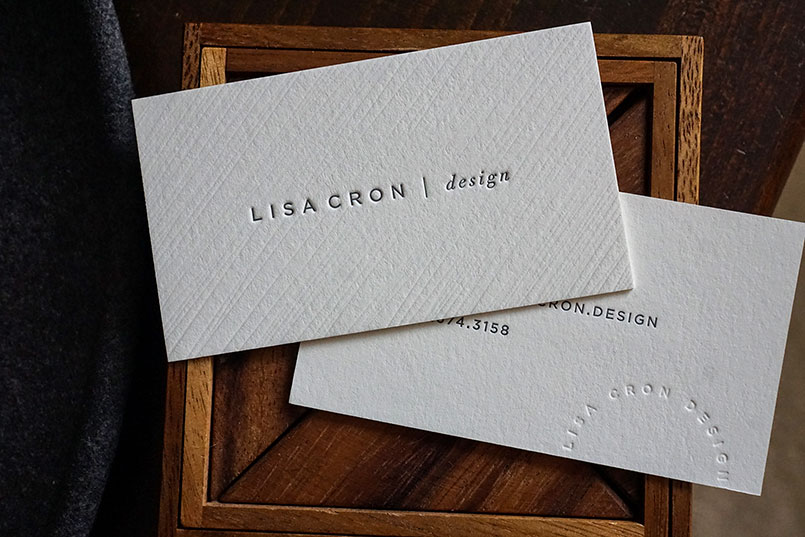
We enjoyed seeing the final results of this design we printed for Lisa Cron. The diagonal pattern on the paper was made first using a blind impression, which was a clever way she used to create a unique paper texture. Printed on Crane's 220# Lettra. ∞
• • •

Black & Blind
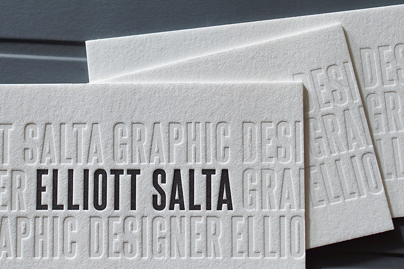
Elliott Salta's cards are a perfect example of using a blind (inkless) letterpress impression for both form and function. These double sided letterpress printed business cards were printed on Crane's 220# Lettra, which helped accommodate the deep impression and amplified the contrast between the black and blind hits. ∞
• • •

Deep Impressions
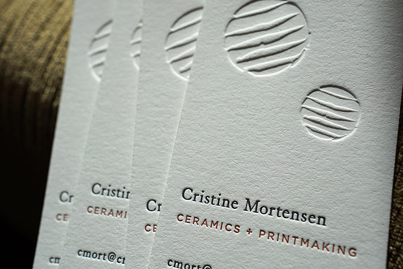
These cards for Cristine Mortensen were printed on Crane's 220# Lettra. They are printed with two colors and a very deep blind (inkless) impression. Layout by minimalist designer, Kaori Drome. ∞
• • •

Hoban Press
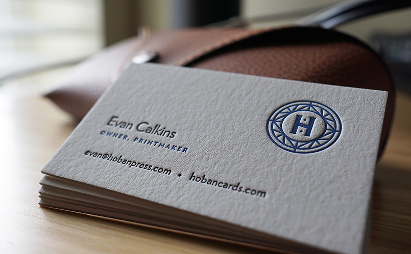
We recently decided to refresh our own business cards. These are a two color card printed on Crane's Pearl White Lettra, 220# (600gsm). They are sized slightly smaller than a conventional business card at 48mm x 80mm and typeset in the wonderful Verlag. ∞
• • •

Die Cut & Letterpress Printed Surfdays Tags
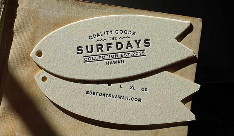
These simple 1 color double sided die cut letterpress printed tags we did for Surfdays are a great example of how coupling a minimal design with an interesting die shape can really make your piece both understated and unique. These were letterpress printed and die cut on our 1970 Heidelberg Windmill using Crane's 220# Lettra in Ecru. ∞
• • •

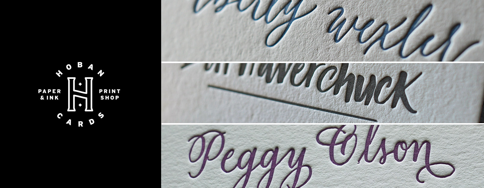
I'm especially excited for our recent collaboration with Sarah Barrett. Her artwork looks stunning letterpress printed and makes for the perfect mix of elegance and uniqueness on a card. For each order, she letters your name by hand (we do not use a font for these) and then submits a high resolution scan. We then create a letterpress plate from her artwork to produce the final printed piece. A memorable mix of Letterpress printing and Calligraphy.
We are offering three styles in both single and double sided versions over at Hoban Cards. Here's a quick breakdown of each style:
The Wayward (Double Sided / Single Sided)
The Wayward's lettering style has a modern letterform that can come off as both fun and lighthearted while also elegant and professional.
The Vagabond (Double Sided / Single Sided)
The Vagabond features a more bold, utilitarian letterform that's reminiscent of the broad brushstrokes of classic signage lettering with a bit of its own flair.
The Valentina (Double Sided / Single Sided)
The Valentina is has more whimsy of the three styles. But, its strokes are also a bit rustic. The most striking characteristic is the ornate swashes and exagagerated descenders.
Even though we are currently featuring these styles on Hoban Cards, we can also use and adapt them for custom work for business cards, note cards and wedding invitations / stationery.
• • •

In 2011 I had an idea to help minimize the cost of custom letterpress printing by launching a tiny one page website called Hoban Cards, which leveraged my pre designed calling card templates to streamline the process while still introducing something beautiful and unique.
Today I'm proud to announce a much more mature website and marketplace, the third iteration of Hoban Cards.
Along with a fresh new design and logo, we've added some needed user facing features, including: A Responsive Layout, User Accounts, Order Status Updates, Automated Discounted Reorders, Automated Shipment Tracking, PDF Mockups as an Option During Checkout and A Proper Shopping Cart.
In addition to the above improvements, we've expanded our product line by adding two new product categories:
Note Cards

With the original spirit of the calling cards in mind, I'm kicking off our new line of custom note cards with three attractive notecard layouts . The note cards include matching envelopes and are printed on the same Crane's Lettra 100% cotton stock as our calling cards.
Stationery Sets

These correspondence sets include matching note cards and calling cards. A perfect idea for a gift or quick way to enhance your correspondence game.
For the launch, we've also added two new calling card templates:
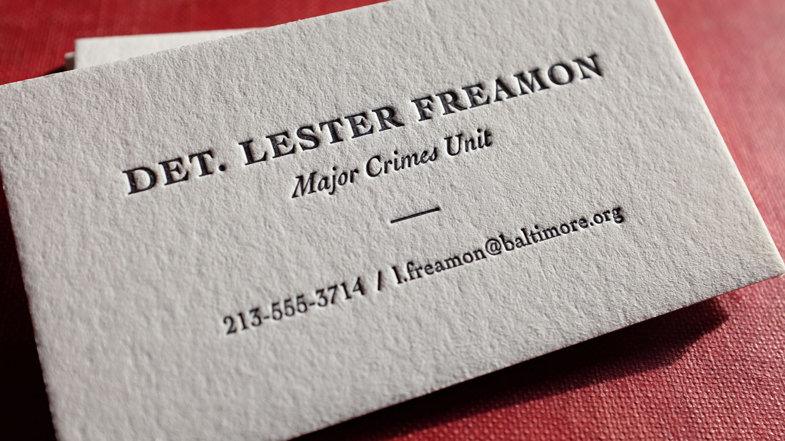
The Detective

Using one of my all time favorite typefaces, Cochin, this card is built with professional elegance in mind. An understated card right for a self assured detective. You know... like Lester from The Wire. See It →
The Requisite Card

This is a beautiful double sided card that features your name or business as a blind (inkless impression) on one side with a simple area for contact information on the other. This automatically ships with double thick 220# stock to accommodate impressions on both sides of the card – Our first double sided calling card layout. See It →
Thanks for all your wonderful support for Hoban Cards and Hoban Press! This is a major launch for our small three person team and we're excited to continue to release new, beautiful letterpress printed layouts through our new website!
• • •

Edge Painting
I'm pleased to announce we are now offering edge painting as one of our capabilities!
The process of edge painting, or inking the edges of the cards, is a service I've been wanting to offer for some time. The technique is tricky to perfect – it's time consuming and a challange to produce consistent, quality results. If done incorrectly, the paint can seep into the edges of the cards and bleed through to the face.
Through trial and error I've found a process I'm very comfortable with that involves clamping small stacks of freshly cut cards and using an airbrush to finish the edges. The flow of paint through the airbrush, sharpness of the knife on the paper cutter, clamping pressure, drying time, and card separation are just a few variables that effect the final edge painted card.
Consideration for Designers
Paper
We prefer to edge paint Crane's double thick Lettra (pictured above), which is 600gsm (220lb). Other quality papers of similar thickness will also work well. We can't edge paint black or dark paper yet.
Color
It's best to use primary / bold colors for the edges of the card. If you're using a subtle color for the letterpress ink, it's difficult to perfectly match that color to the edges. This is because the letterpress ink isn't the same ink used to paint the edges.
Quantity
To start out, we are currently only taking short runs (100 - 250 card orders) for edge painting work. ∞
• • •

The Writer
I'm extremely excited to announce at the end of 2014 I was able to quit my day job as a web developer to focus 100% of my time on Hoban Press and Hoban Cards. (Yippee!!) I'm looking forward to releasing new products and designs more regularly.
Today I'm releasing six new letterpress printed calling card templates at Hoban Cards. Here's a short description of, and link to, the new templates available — all starting at $75.
The Esquire
A bordered card fit for a classy professional. While a great all around conservative choice, this template would work especially well for someone involved in law or finance.
The Professor
This mini-card, measuring in at 86mm x 34mm is typeset in one of my all time favorite fonts: Columbia Titling. These are a more dressed up version of the The Bijou (below).
The Trade Card
Perhaps my favorite of the new bunch, these UK sized cards are also typeset in Columbia Titling and are designed to lean toward a business card, rather than a calling card.
The Minimalist
These modern cards are fantastically balanced and sophisticated. The medium grey ink and wide tracking really set them off.
The Bijou
'Bijou' is a great word. It means a small piece of craftsmanship. A fitting name for these mini cards typeset in a wonderful modern font called Effra.
The Writer (pictured above)
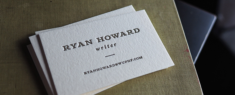
I'm not a writer, but if I were, I'd pick these ones. Trustworthy, balanced, and warm are a few adjectives that come to mind when I see this one. gold-brown ink on cream stock.
On Sale
Two templates that were previously at the $75 price point are currently on sale for $50. Checkout the much loved Typewriter Card and The Scholar. ∞
• • •

Ann Schoew
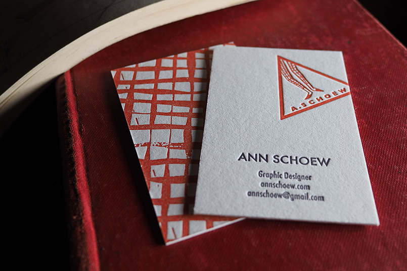
Here's another card with a creative use of texture. In edition to the back side of the card, we love these because of Ann's great logo and how she chose the placement of it on the card.
These cards are printed on Crane's 220# (600gsm) Lettra. Checkout Ann's graphic design work on her website: http://annschoew.com ∞
• • •

On the Sly
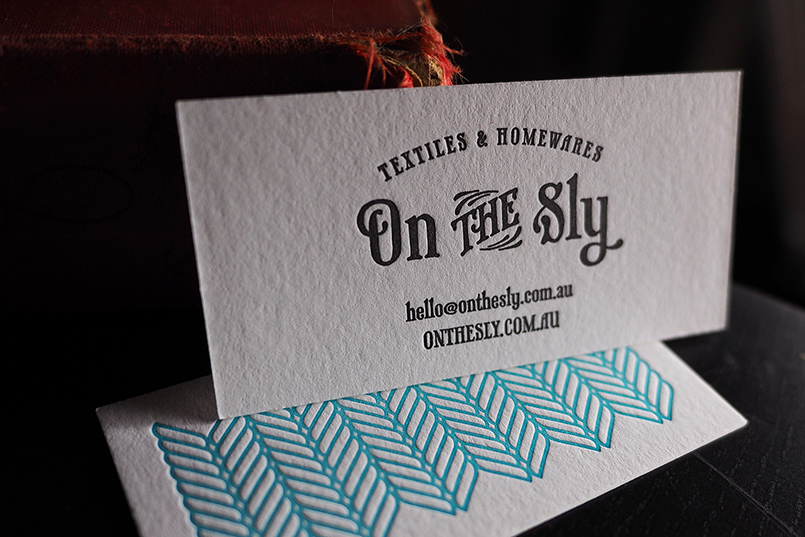
We particularly like how these simple 2 color double sided cards came together. Simple patterns look great letterpress printed and often times add a special custom touch. The texture produced by the pattern as an impression on the back of the card makes it that much more fun to handle as well!
These cards are printed on Crane's 220# (600gsm) Lettra. And, if you're into awesome patterns as much as we are, checkout the On the Sly webpage for some amazing textiles. ∞
• • •

Noah Gundersen - Ledges Lyric Sheet
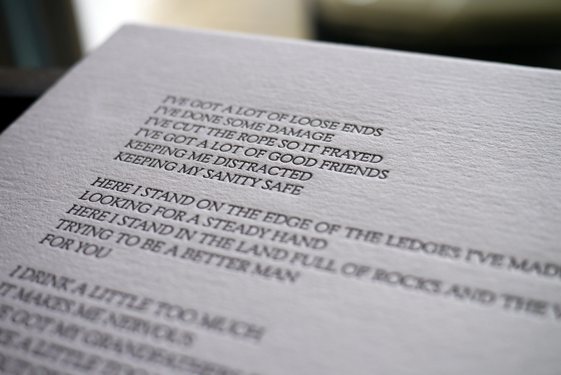
Noah Gundersen, a good friend from my hometown, contacted me to print some simple lyric sheets for his newly released album, Ledges. These were printed on our Heidelberg Windmill on the wonderful 140# Holyoke Rag.
If you haven't heard Noah's music, do yourself a favor and look him up. Download or stream his most recent album, or head over to his Bandcamp page and listen to his prior album, Family. You may have recognized his music if you're a Sons of Anarchy fan, as his songs have been feaured on a few episodes. There are also countless videos of Noah and his sister Abby performing on YouTube.
The music video to the above lyric sheet is also a great place to start! ∞
• • •

Keikeu Cake Boutique
We recently printed these lovely off-sized business cards for Keikeu Cake Boutique. They were printed on 220lb Crane Lettra and beautifully utilize a blind impression as a background for the logo side of the card. Layout / Design by Kaori Drome. ∞
• • •

King Wedding Invites
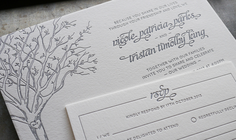
In addition to business cards and small stationery items, we've been printing more wedding invitations lately. This small wedding package, which included invitations and RSVP cards were printed on 220lb Crane Lettra on our 1957 Heidelberg Windmill.
The one color design was submitted to us by Nicole and Tristan and exemplifies how beautiful typography is perfectly accentuated by letterpress printing. ∞
• • •

Hunter Light
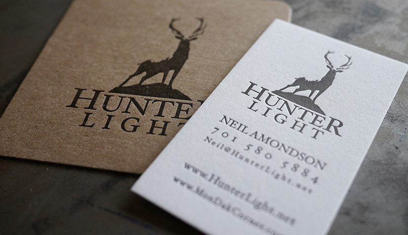
We’ve recently completed a couple coaster / business card combinations, which work out very nicely as a simple branding package. Coasters make lovely, unique gifts and certainly get noticed.
This small package was printed for a new business of a long time family friend. We chose to contrast the Pearl White Crane Lettra stock on the business card with a hefty chipboard for the coasters. The dark brown ink on both pieces pulled it all together. ∞
• • •

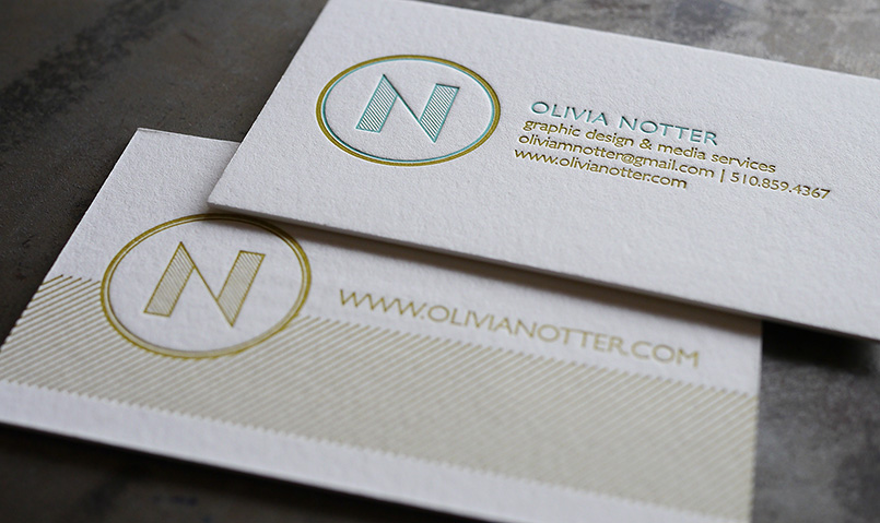
Olivia Notter
Graphic designer, Olivia Notter, had us letterpress print these fantastic double sided business cards. The color combination and unique design made these one of our favorites. Thin lines and patterns generally look very nice with the letterpress printing process. ∞
• • •

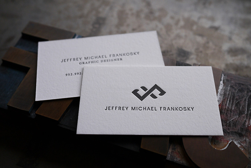
Jeffrey Michael Frankosky
Jeffrey Michael Frankosky submitted a beautifully composed design with a clever logo-mark, which I particularly like. These cards are letterpress printed on 220lb Crane Lettra and are a great example of how excellent typography can really make a card special. ∞
• • •

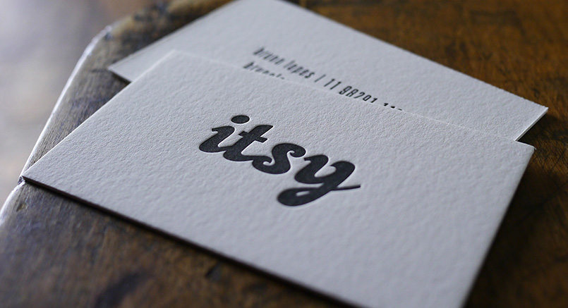
Itsy, Inc.
I love this simple layout submitted by itsy.com.br. Printed on Pearl White 220lb Crane Lettra. ∞
• • •
